Relayout Fatebook
Relayout Fatebook
Relayout Fatebook


Category
Web Development
Category
Web Development
Category
Web Development
Sector
Tech
Sector
Tech
Sector
Tech
Year
2022
Year
2022
Year
2022
This case study focuses on a web design project undertaken for XYZ Company, an e-commerce platform specializing in selling handmade crafts. The objective of the project was to revamp the existing website and address several key problems, ultimately improving user experience and driving increased conversions. This case study outlines the problems faced, the solutions implemented, and the results achieved through the web design project.
Problems
Outdated and Unresponsive Design
The existing website had an outdated design that was not optimized for mobile devices, resulting in a poor user experience. The lack of responsiveness hindered potential customers from accessing the platform on various devices, leading to a high bounce rate and decreased conversions.
Complex Navigation and Information Architecture
The website's navigation structure was convoluted, making it difficult for users to find the products they were looking for. The information architecture was disorganized, causing confusion and frustration among visitors, leading to increased bounce rates.
Inadequate Visual Appeal and Branding
The website lacked visual appeal and failed to effectively communicate the brand's identity. The absence of cohesive branding elements, such as a logo, consistent color scheme, and typography, undermined the brand's credibility and failed to establish a strong connection with potential customers.
Solutions

Responsive Design and Mobile Optimization
To address the issue of an outdated and unresponsive design, the web design team implemented a responsive design framework. This ensured that the website would adapt seamlessly to various screen sizes, providing a consistent and user-friendly experience across desktops, tablets, and mobile devices.
Streamlined Navigation and Improved Information Architecture
The team conducted a thorough analysis of user behavior and preferences, leading to the implementation of a streamlined navigation structure. This involved simplifying the menu hierarchy, introducing intuitive category labels, and improving search functionality. Additionally, the information architecture was reorganized to enhance user flow and enable users to find relevant products more easily.
Visual Redesign and Branding Enhancement
To enhance the visual appeal and branding of the website, the design team created a modern and visually engaging interface. They developed a new logo that captured the essence of the brand, incorporated consistent color schemes, and employed appropriate typography. The overall visual design aligned with the brand's identity, establishing a more cohesive and memorable experience for users.
Results
Improved User Experience and Engagement
Following the web design project, the website's bounce rate significantly decreased as users found it easier to navigate and locate desired products. The enhanced user experience resulted in increased engagement metrics, such as longer session durations, a higher number of page views per session, and reduced cart abandonment rates.
Increased Conversion Rates
The revamped website's improved usability, intuitive navigation, and visually appealing design contributed to an increase in conversions. Visitors were more inclined to make purchases due to the enhanced user experience, ultimately resulting in higher sales and revenue for XYZ Company.
Positive Brand Perception and Recognition
The revamped website successfully conveyed the brand's identity through a cohesive visual design and branding elements. This led to improved brand recognition and a stronger connection with the target audience. The website's professional appearance and user-friendly interface positively impacted the brand's perception, building trust and credibility among users.

Conclusion
Through the web design project, XYZ Company was able to overcome the challenges posed by an outdated website design. The implementation of responsive design, streamlined navigation, and improved visual appeal resulted in a remarkable improvement in user experience, increased conversions, and positive brand perception. This case study highlights the importance of thoughtful web design in achieving business objectives and driving growth in the digital realm.
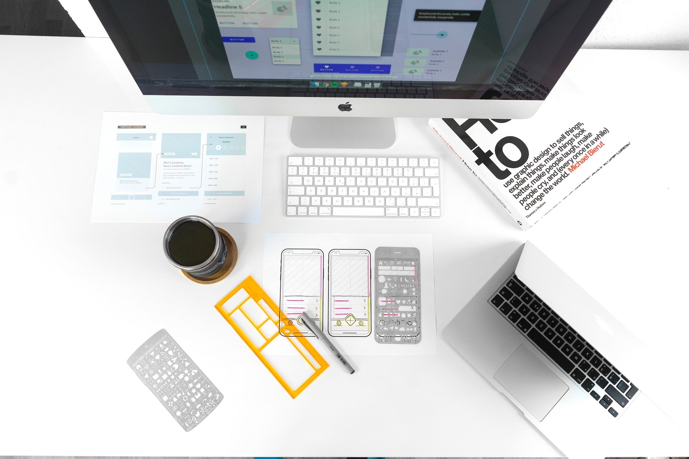
Generated with AI. Images form Unsplash
This case study focuses on a web design project undertaken for XYZ Company, an e-commerce platform specializing in selling handmade crafts. The objective of the project was to revamp the existing website and address several key problems, ultimately improving user experience and driving increased conversions. This case study outlines the problems faced, the solutions implemented, and the results achieved through the web design project.
Problems
Outdated and Unresponsive Design
The existing website had an outdated design that was not optimized for mobile devices, resulting in a poor user experience. The lack of responsiveness hindered potential customers from accessing the platform on various devices, leading to a high bounce rate and decreased conversions.
Complex Navigation and Information Architecture
The website's navigation structure was convoluted, making it difficult for users to find the products they were looking for. The information architecture was disorganized, causing confusion and frustration among visitors, leading to increased bounce rates.
Inadequate Visual Appeal and Branding
The website lacked visual appeal and failed to effectively communicate the brand's identity. The absence of cohesive branding elements, such as a logo, consistent color scheme, and typography, undermined the brand's credibility and failed to establish a strong connection with potential customers.
Solutions

Responsive Design and Mobile Optimization
To address the issue of an outdated and unresponsive design, the web design team implemented a responsive design framework. This ensured that the website would adapt seamlessly to various screen sizes, providing a consistent and user-friendly experience across desktops, tablets, and mobile devices.
Streamlined Navigation and Improved Information Architecture
The team conducted a thorough analysis of user behavior and preferences, leading to the implementation of a streamlined navigation structure. This involved simplifying the menu hierarchy, introducing intuitive category labels, and improving search functionality. Additionally, the information architecture was reorganized to enhance user flow and enable users to find relevant products more easily.
Visual Redesign and Branding Enhancement
To enhance the visual appeal and branding of the website, the design team created a modern and visually engaging interface. They developed a new logo that captured the essence of the brand, incorporated consistent color schemes, and employed appropriate typography. The overall visual design aligned with the brand's identity, establishing a more cohesive and memorable experience for users.
Results

Improved User Experience and Engagement
Following the web design project, the website's bounce rate significantly decreased as users found it easier to navigate and locate desired products. The enhanced user experience resulted in increased engagement metrics, such as longer session durations, a higher number of page views per session, and reduced cart abandonment rates.
Increased Conversion Rates
The revamped website's improved usability, intuitive navigation, and visually appealing design contributed to an increase in conversions. Visitors were more inclined to make purchases due to the enhanced user experience, ultimately resulting in higher sales and revenue for XYZ Company.
Positive Brand Perception and Recognition
The revamped website successfully conveyed the brand's identity through a cohesive visual design and branding elements. This led to improved brand recognition and a stronger connection with the target audience. The website's professional appearance and user-friendly interface positively impacted the brand's perception, building trust and credibility among users.

Conclusion
Through the web design project, XYZ Company was able to overcome the challenges posed by an outdated website design. The implementation of responsive design, streamlined navigation, and improved visual appeal resulted in a remarkable improvement in user experience, increased conversions, and positive brand perception. This case study highlights the importance of thoughtful web design in achieving business objectives and driving growth in the digital realm.

Generated with AI. Images form Unsplash
This case study focuses on a web design project undertaken for XYZ Company, an e-commerce platform specializing in selling handmade crafts. The objective of the project was to revamp the existing website and address several key problems, ultimately improving user experience and driving increased conversions. This case study outlines the problems faced, the solutions implemented, and the results achieved through the web design project.
Problems
Outdated and Unresponsive Design
The existing website had an outdated design that was not optimized for mobile devices, resulting in a poor user experience. The lack of responsiveness hindered potential customers from accessing the platform on various devices, leading to a high bounce rate and decreased conversions.
Complex Navigation and Information Architecture
The website's navigation structure was convoluted, making it difficult for users to find the products they were looking for. The information architecture was disorganized, causing confusion and frustration among visitors, leading to increased bounce rates.
Inadequate Visual Appeal and Branding
The website lacked visual appeal and failed to effectively communicate the brand's identity. The absence of cohesive branding elements, such as a logo, consistent color scheme, and typography, undermined the brand's credibility and failed to establish a strong connection with potential customers.
Solutions

Responsive Design and Mobile Optimization
To address the issue of an outdated and unresponsive design, the web design team implemented a responsive design framework. This ensured that the website would adapt seamlessly to various screen sizes, providing a consistent and user-friendly experience across desktops, tablets, and mobile devices.
Streamlined Navigation and Improved Information Architecture
The team conducted a thorough analysis of user behavior and preferences, leading to the implementation of a streamlined navigation structure. This involved simplifying the menu hierarchy, introducing intuitive category labels, and improving search functionality. Additionally, the information architecture was reorganized to enhance user flow and enable users to find relevant products more easily.
Visual Redesign and Branding Enhancement
To enhance the visual appeal and branding of the website, the design team created a modern and visually engaging interface. They developed a new logo that captured the essence of the brand, incorporated consistent color schemes, and employed appropriate typography. The overall visual design aligned with the brand's identity, establishing a more cohesive and memorable experience for users.
Results

Improved User Experience and Engagement
Following the web design project, the website's bounce rate significantly decreased as users found it easier to navigate and locate desired products. The enhanced user experience resulted in increased engagement metrics, such as longer session durations, a higher number of page views per session, and reduced cart abandonment rates.
Increased Conversion Rates
The revamped website's improved usability, intuitive navigation, and visually appealing design contributed to an increase in conversions. Visitors were more inclined to make purchases due to the enhanced user experience, ultimately resulting in higher sales and revenue for XYZ Company.
Positive Brand Perception and Recognition
The revamped website successfully conveyed the brand's identity through a cohesive visual design and branding elements. This led to improved brand recognition and a stronger connection with the target audience. The website's professional appearance and user-friendly interface positively impacted the brand's perception, building trust and credibility among users.

Conclusion
Through the web design project, XYZ Company was able to overcome the challenges posed by an outdated website design. The implementation of responsive design, streamlined navigation, and improved visual appeal resulted in a remarkable improvement in user experience, increased conversions, and positive brand perception. This case study highlights the importance of thoughtful web design in achieving business objectives and driving growth in the digital realm.

Generated with AI. Images form Unsplash
